
Get Fluent In Our Brand
Access and download Fluent brand assets. Explore the design elements and content styles that tell our brand story.
Content Style
We talk like we’re in the room with you—because we’re in this together.
We don’t just explain the future of commerce media—we make it feel possible. Our tone is smart but approachable, confident but collaborative. Everything we say should leave our partners thinking: Let’s go.
Personality: We’re dynamic, curious, and always on.
We challenge outdated thinking and reframe what’s possible. Our content doesn’t lecture—it energizes. We’re the expert who shares the playbook and doesn’t hoard it. We’re proud of what we’ve built but even more excited about what’s next.
Fluent’s voice is:- Conversational but expert
- Passionate but practical
- Optimistic but grounded
- Punchy but precise
- Customer-obsessed but never salesy
At Fluent, our visual identity complements our written voice, guided by our core values. Our company boilerplate establishes the foundation for who we are, while our brand tone and voice convey how we strive to be perceived.
Fluent, Inc. (NASDAQ: FLNT) is a commerce media solutions provider connecting top-tier brands with highly engaged consumers. Leveraging exclusive ad inventory, robust first-party data, and proprietary machine learning, Fluent unlocks additional revenue streams for partners and empowers advertisers to acquire their most valuable customers at scale. Founded in 2010, Fluent uses its deep expertise in performance marketing to drive monetization and increase engagement at key touchpoints across the customer journey. For more insights visit https://www.fluentco.com/.
Logo
The wordmark in our Fluent blue can be placed on white or our Fluent fog. It can also be reversed sitting on any of our primary blue shades.
The clear space surrounding the logo is defined by the width and height of the Fluent ‘N.’ This space ensures that the logo has sufficient breathing room.
Type
Fluent uses the Google font Roboto. It is a neo-grotesque sans-serif typeface family developed for the Android mobile operating system. Roboto can be downloaded directly from Google.
Roboto
abcdefghijk lmnopqrst uvwxyz
abcdefghijk lmnopqrst uvwxyz
12345678 90?!@#$&*
Roboto has a wide variety of weights that can be used in our type hierarchy.
Roboto Light
Fuel Business Growth with Fluent
Roboto Regular
Fuel Business Growth with Fluent
Roboto Medium
Fuel Business Growth with Fluent
Roboto Bold
Fuel Business Growth with Fluent
Hierarchy limits are set for both print and web applications.
Bold 44-48pts
Main Headline Copy
Regular 18pts
Subtitle Copy
Regular 10pts
Body Copy: Bis idundig endistio. Ut aborpor epresci entureruntio qui tem facerero cus ium qui testi temporesto.
Bold 44-48pts
Main Headline Copy
Regular 18pts
Subtitle Copy
Regular 18-22pts
Body Copy: Bis idundig endistio. Ut aborpor epresci entureruntio qui.
Color
Fluent blue is our main brand color. It is bold yet approachable, serving as a vibrant expression of our confidence, accessibility, and forward-thinking approach to business. This color is always represented in all Fluent print and digital assets.
The ‘Monetize’ color palette represents a subdivision of Fluent’s main product and value offering. This palette is used in tandem with our primary and secondary palette and is shown when speaking to our partners.
The ‘Advertise’ color palette represents a subdivision of Fluent’s main product and value offering. This palette is used in tandem with our primary and secondary palette and is shown when speaking to our advertisers.
Our gradients blend the full spectrum of colors from the Fluent color palette.
- Corporate Gradients are designed for use in backgrounds, providing a clean and professional aesthetic.
- Monetize/Advertise Gradients are intended for subtle accents only, adding emphasis without overwhelming the design.out overwhelming the design.
#292EB1
Location 0%
#191371
Location 50%
#0B0B3D
Location 100%
#CEB2F0
Location 0%
#6579DB
Location 50%
#191371
Location 100%
#CEB2F0
Location 0%
#6579DB
Location 50%
#191371
Location 100%
#007F67
Location 0%
#00B592
Location 50%
#B3E42E
Location 100%
#18136C
Location 0%
#00B592
Location 50%
#B3E42E
Location 100%
#FF0078
Location 0%
#FF7161
Location 50%
#F3CD27
Location 100%
#18136C
Location 0%
#FF0078
Location 50%
#FF7161
Location 100%
Illustrations
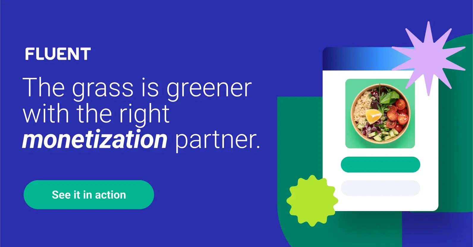
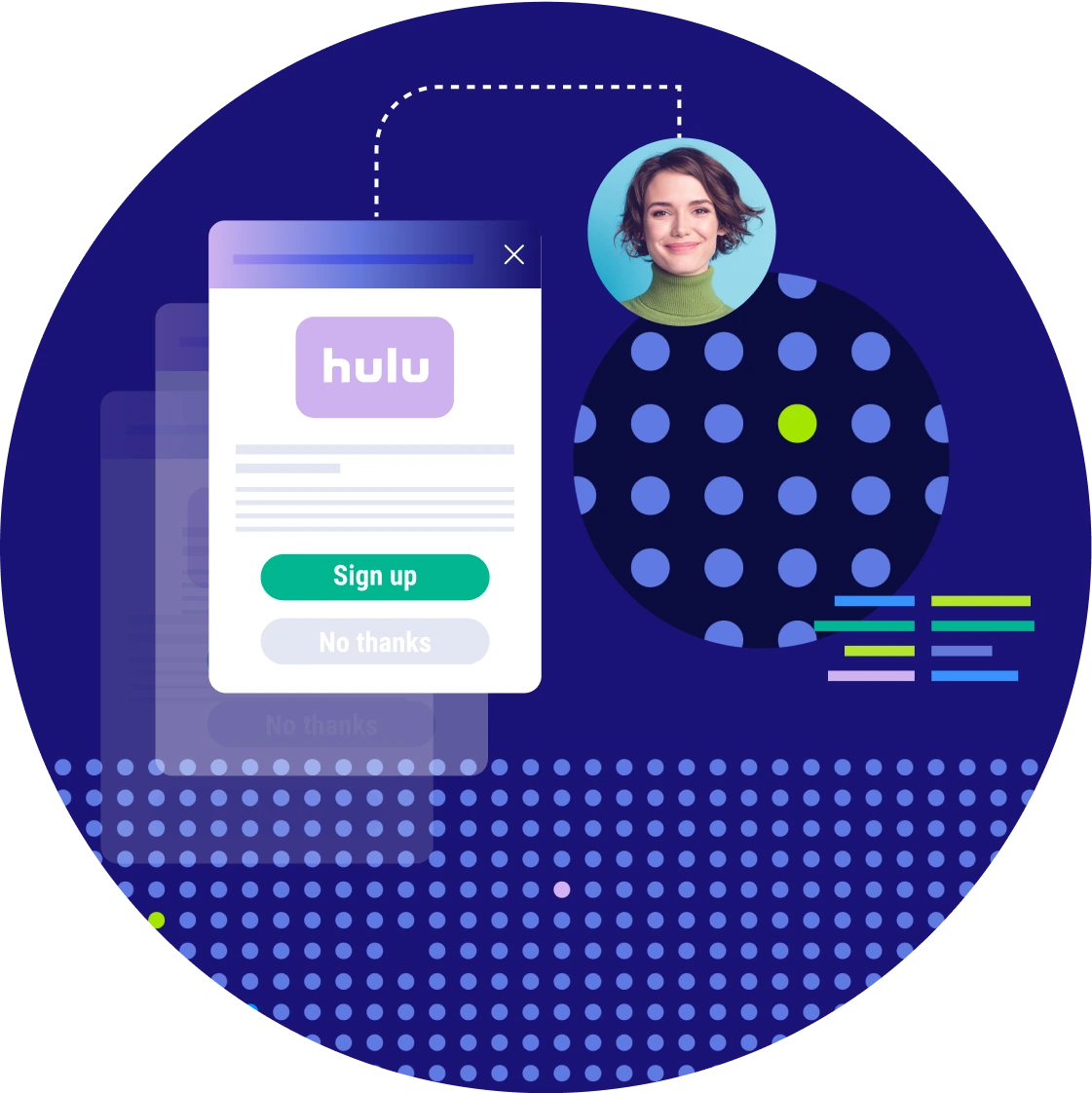
Product illustrations use a combination of layered elements and opacities to simplify our ad inventory and allow for visual focal points.
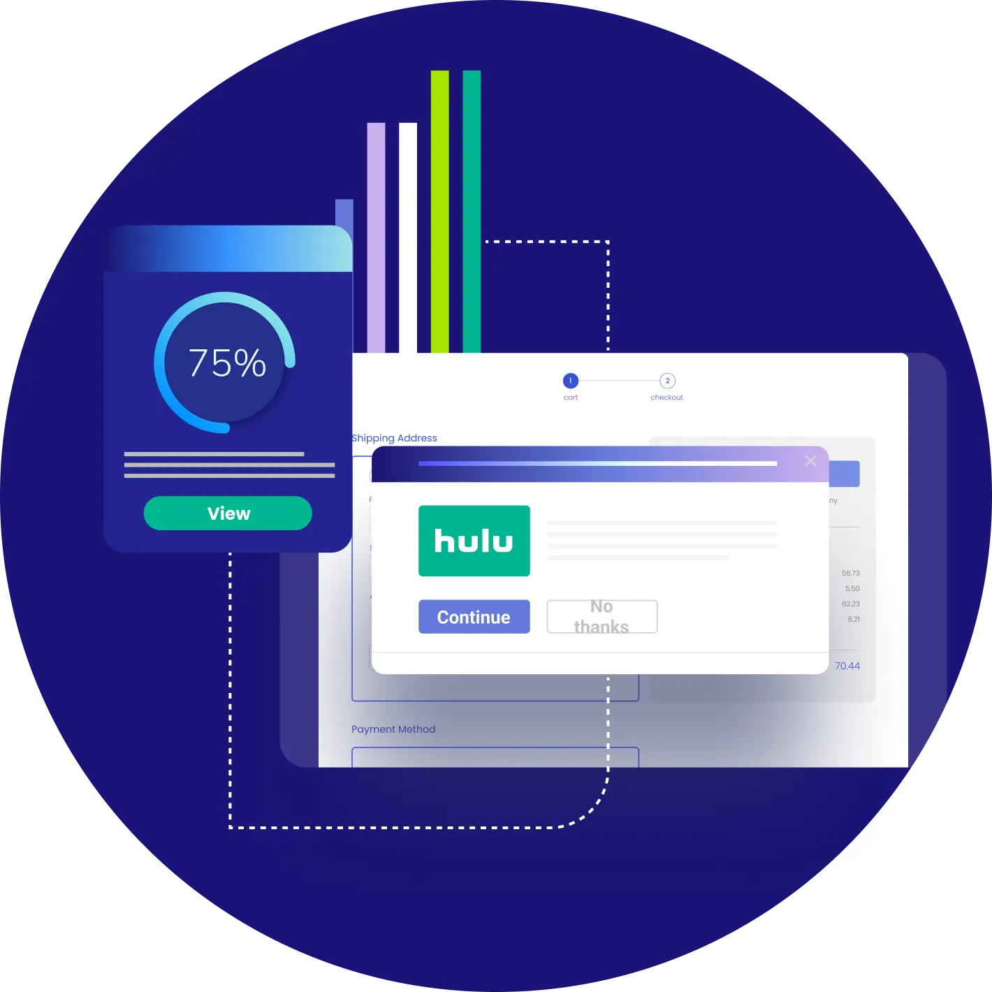
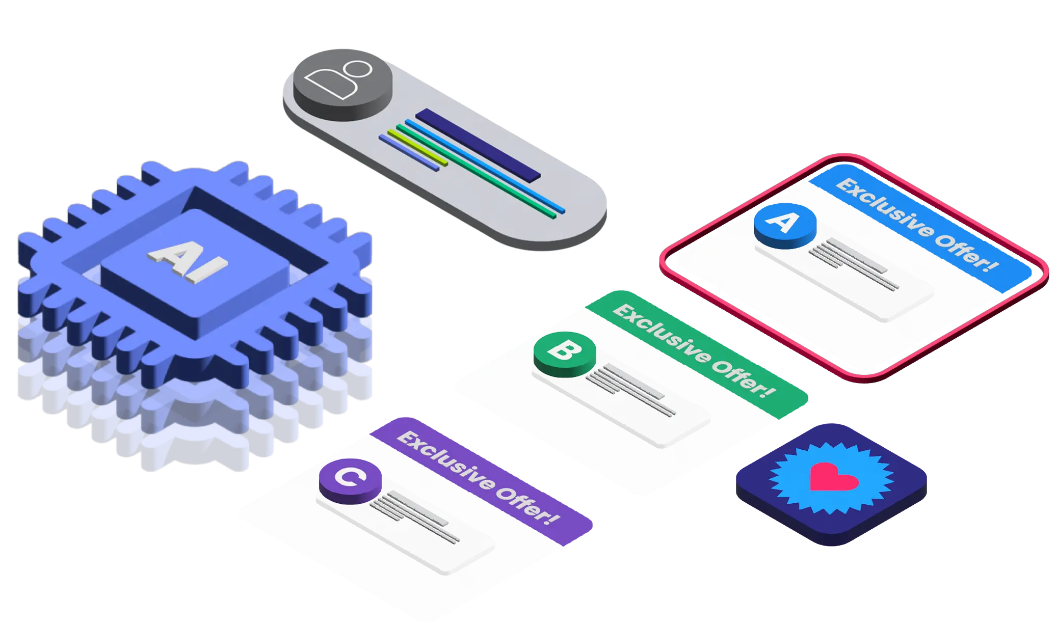
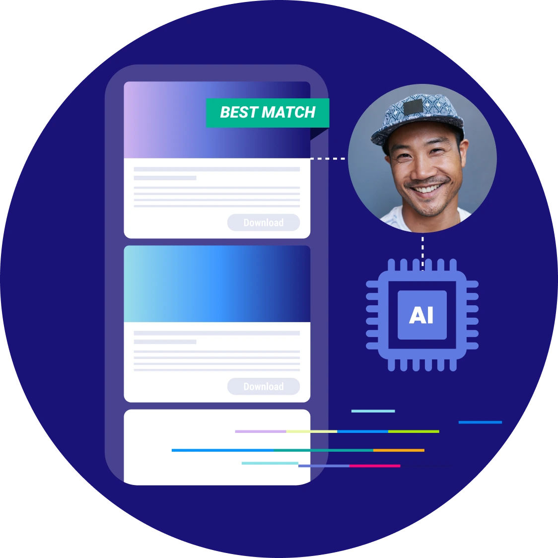
Isometric top angle illustrations enhance the depth and visual appeal of our explainer content, bringing our proprietary AI and machine learning technology to life.
Imagery
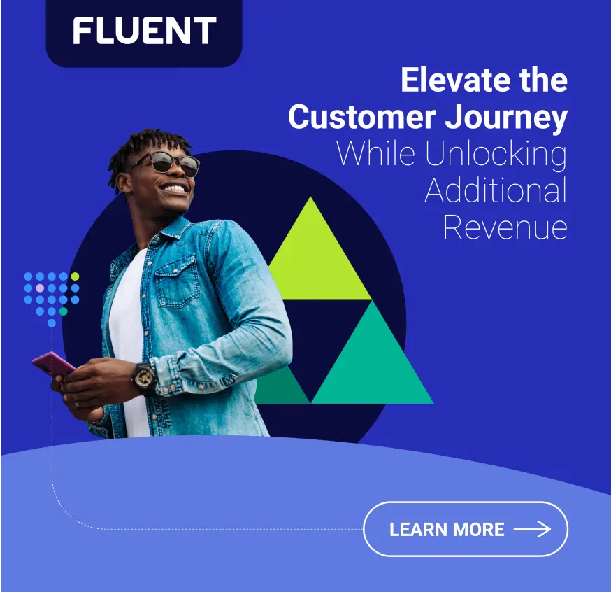
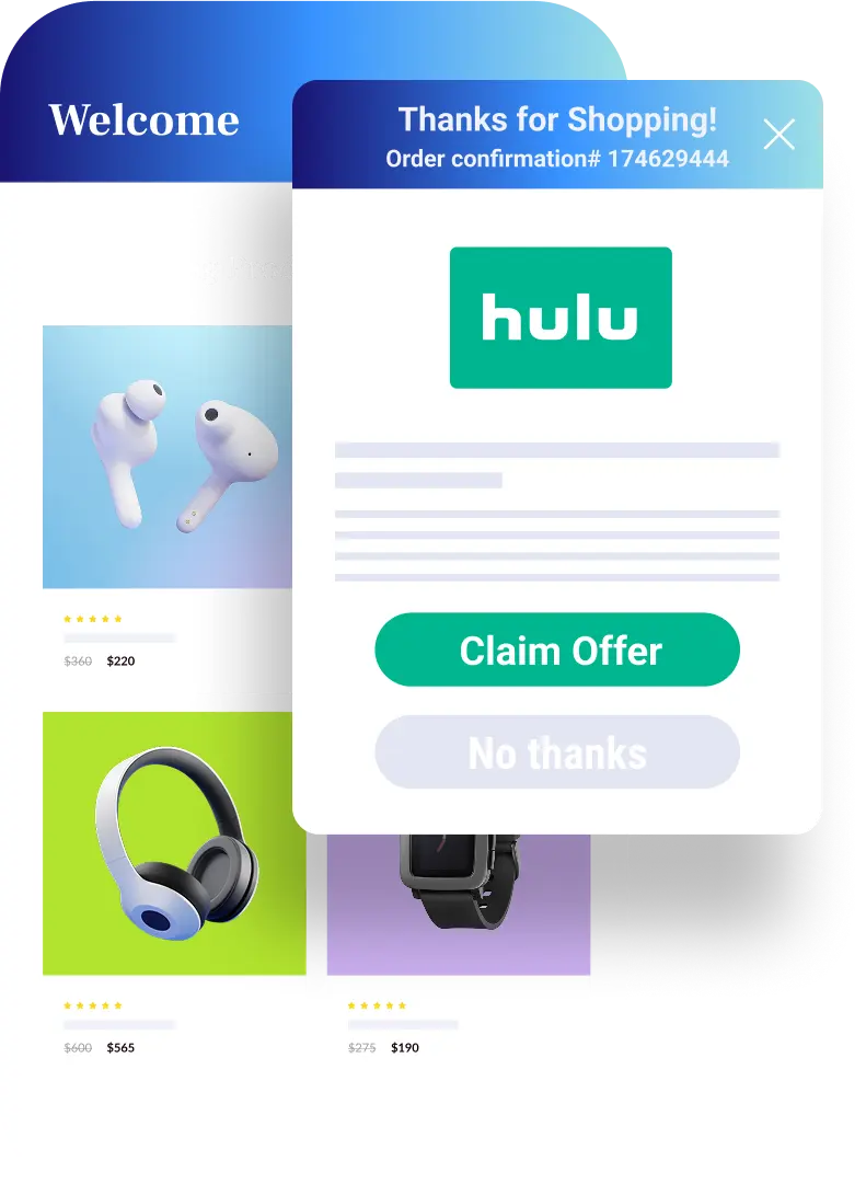
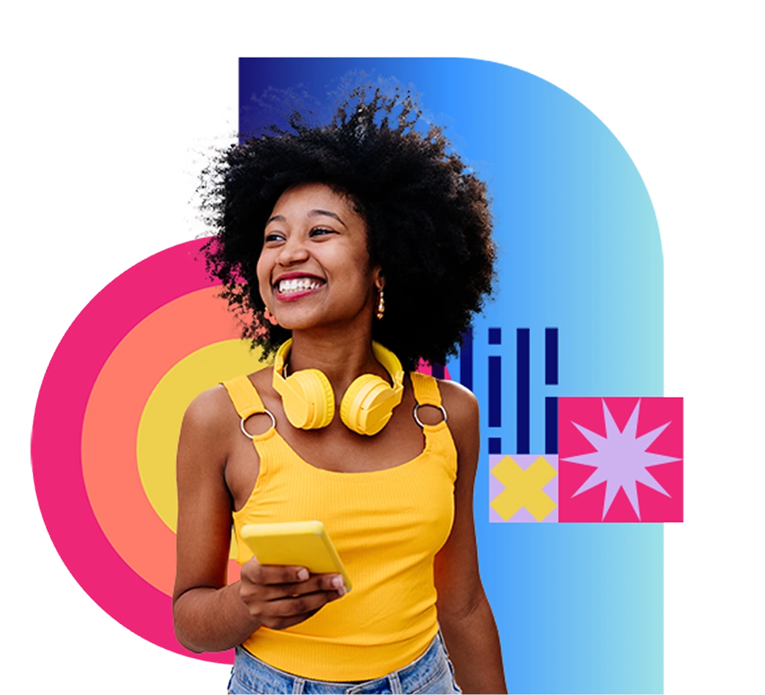
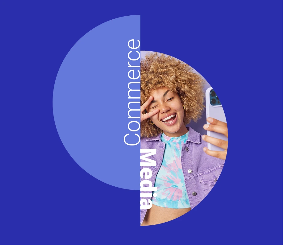
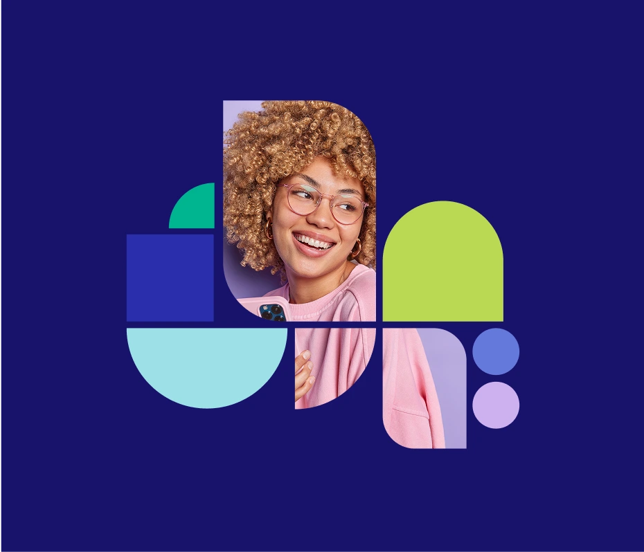
Fluent’s hero images blend graphic elements, illustrations, and cropped candid photos to create dynamic compositions. Subject matter should reflect the youthful, fun, and tech-forward spirit our consumer audience, clients, and team.


Illustrations are used in combination with lifestyle imagery to help shape and tell a story about our offerings and the consumer journey.
Graphic Elements

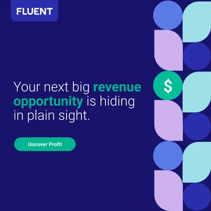
A Simple set of shapes add a bold sense of playfulness, optimism and energy. Shapes are to be used to “shape” our images treatments and help “shape” our story through graphic lock-ups. They are used in conjunction with other graphics that tell the main narrative and are peppered in to add joy. Not to be used in isolation.

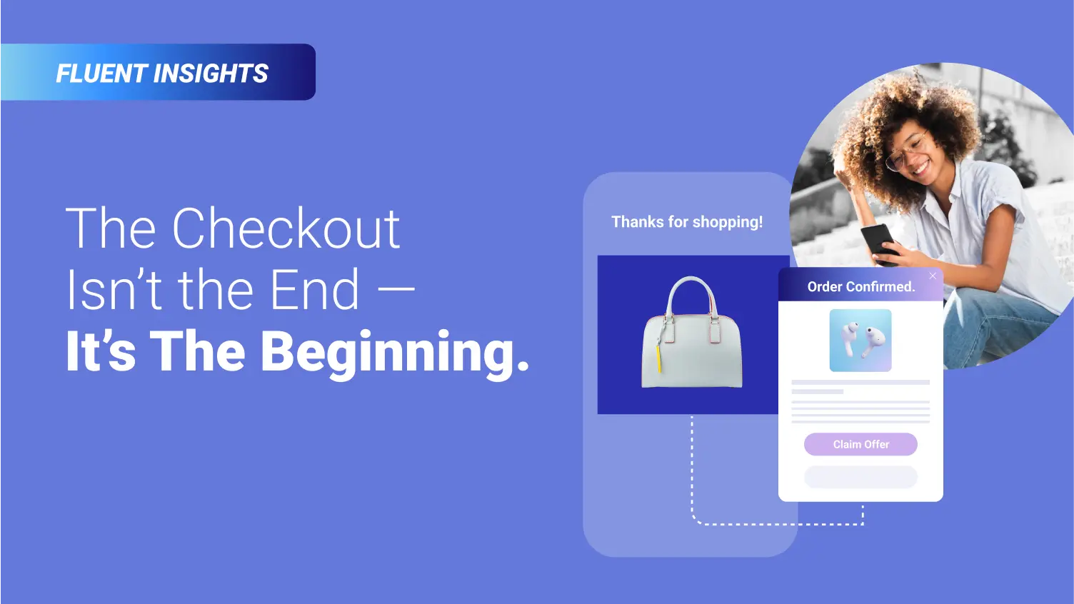
Header lockups to be used to visually determine type of Marketing initiative.


Header lockups to be used to visually determine type of Marketing initiative.

Blue + Light versions in flag for visibility and logo limitations. Outside of flag ONLY when sitting on the Fluent Blue.


Blue + Light versions in flag for visibility and logo limitations. Outside of flag ONLY when sitting on the Fluent Blue. Clear space should be represented by the width of the Fluent “N”.


Visual consistency & communication that indicates a series of content. Our audience understands at a glance what we are talking about.
Our vibrant data lines highlight our extensive reach, showcasing a rich database of over 30 million monthly active visitors across our owned and operated digital platforms.

The dotted line pattern weaves through our hero images and spot illustrations, representing the seamless connections we build between brands and consumers across the entire customer journey. The path includes both hard and rounded corners at a 44pt radius.
